
🎥 Scaled an internal MVP into a B2B self-service product, cutting operational effort by 70% and future design-to-dev time by 80%.
🎥 cofenster is an enterprise-
ready video production solution with no experience required. (B2B)
🎥 cofenster is an enterprise-
ready video production solution with no experience required. (B2B)
🎥 cofenster is an enterprise-ready video production solution with no experience required. (B2B)
🎥 cofenster is an enterprise-ready video production solution with no experience required. (B2B)
Business Challenge
Challenge
Challenge
Challenge
Challenge
The web app is currently only used by internal employees who manually edit and finalize the videos for end customers.The state of the web application is technically implemented, but common UX heuristics for good usability have not been utilized as a basis.
My Role
Product Designer (UX & UI)
My Role
Product Designer (UX & UI)
Project Duration
6 months
Project Duration
6 months

Regarding the project NDA I only show a few final product images in this case study.

Who are the Users?
First, I initiated a kickoff workshop with the startup in which we defined personas using data that the team had already collected.

I also conducted qualitative user interviews with focus group users to define the various use cases for the product. This allowed me to find out how the target users actually want to use and interact with the application when trying to achieve their goals.

Internal Video Production Challenges for Companies
🔴 Limited Experience and Expertise
Employees may have limited experience in video production and lack expertise in the field.
🔴 Limited Resources
Companies might have limited resources such as cameras, lighting equipment, and professional editing software.
🔴 Budget Constraints
Limited budget may limit the ability to rent professional equipment or enlist external services.
🔴 Time Constraints
Employees may have limited time for video production, impacting planning and post production.
Current Application Problems
The current apps each represent the MVP version of the product.
The web app is currently only used by internal employees who manually edit and finalize the videos for customers. The status of the web app has been technically implemented, but no common heuristics have been used as a basis for good usability.
The start-up's next goal is to transition to self-service use by customers as quickly as possible in order to make the product scalable in the future without the need for internal employees. At the same time, the mobile app has some usability gaps and does not currently offer a sufficiently good user experience for end customers who are already active.
Usability Testing & UX Review
To check the current status of the apps, I carried out usability tests with active users of the web app and mobile app. This was followed by a UX evaluation of the current user flow, ranking of UX issues (low hanging fruits, minor/medium/high issues).
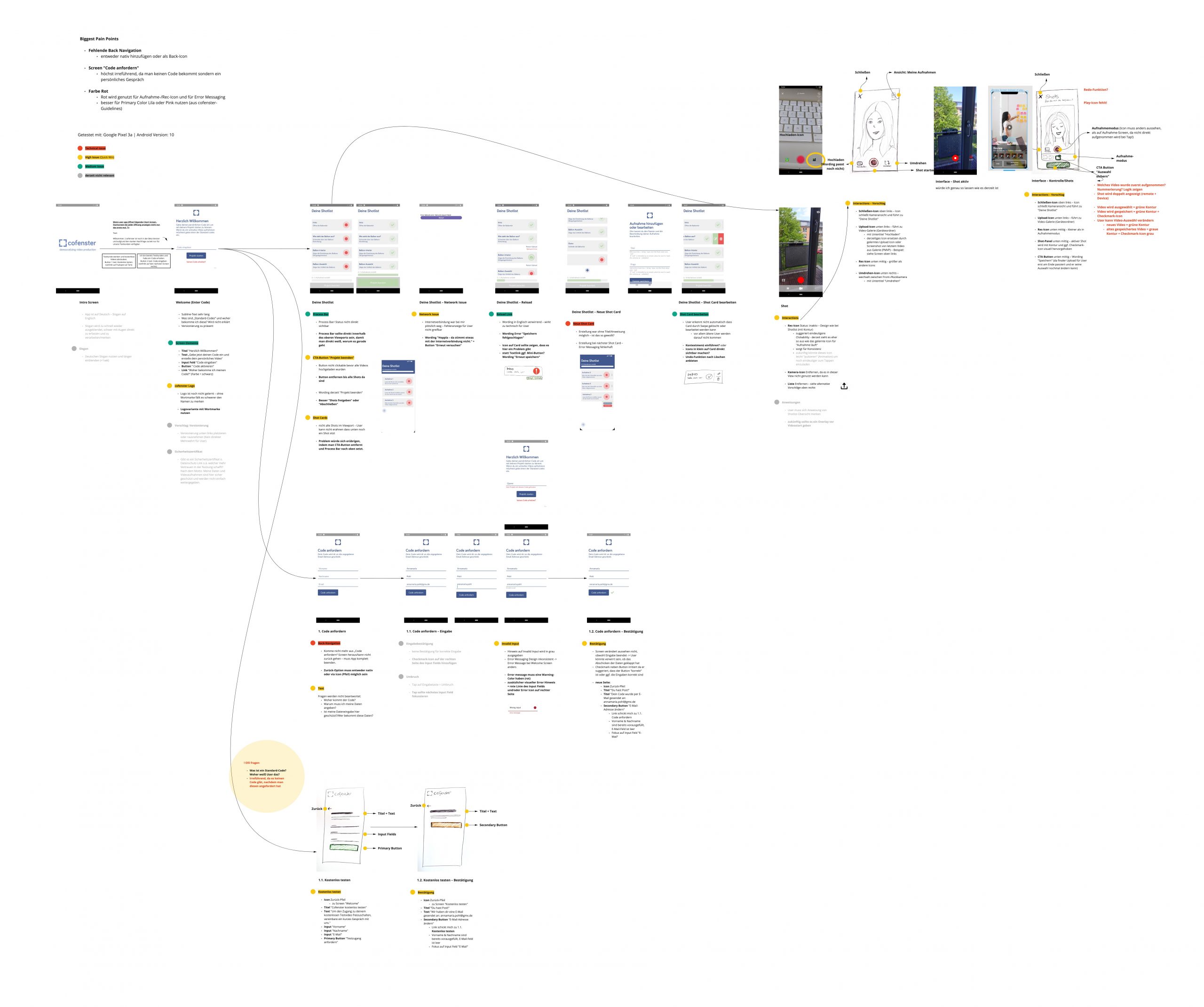
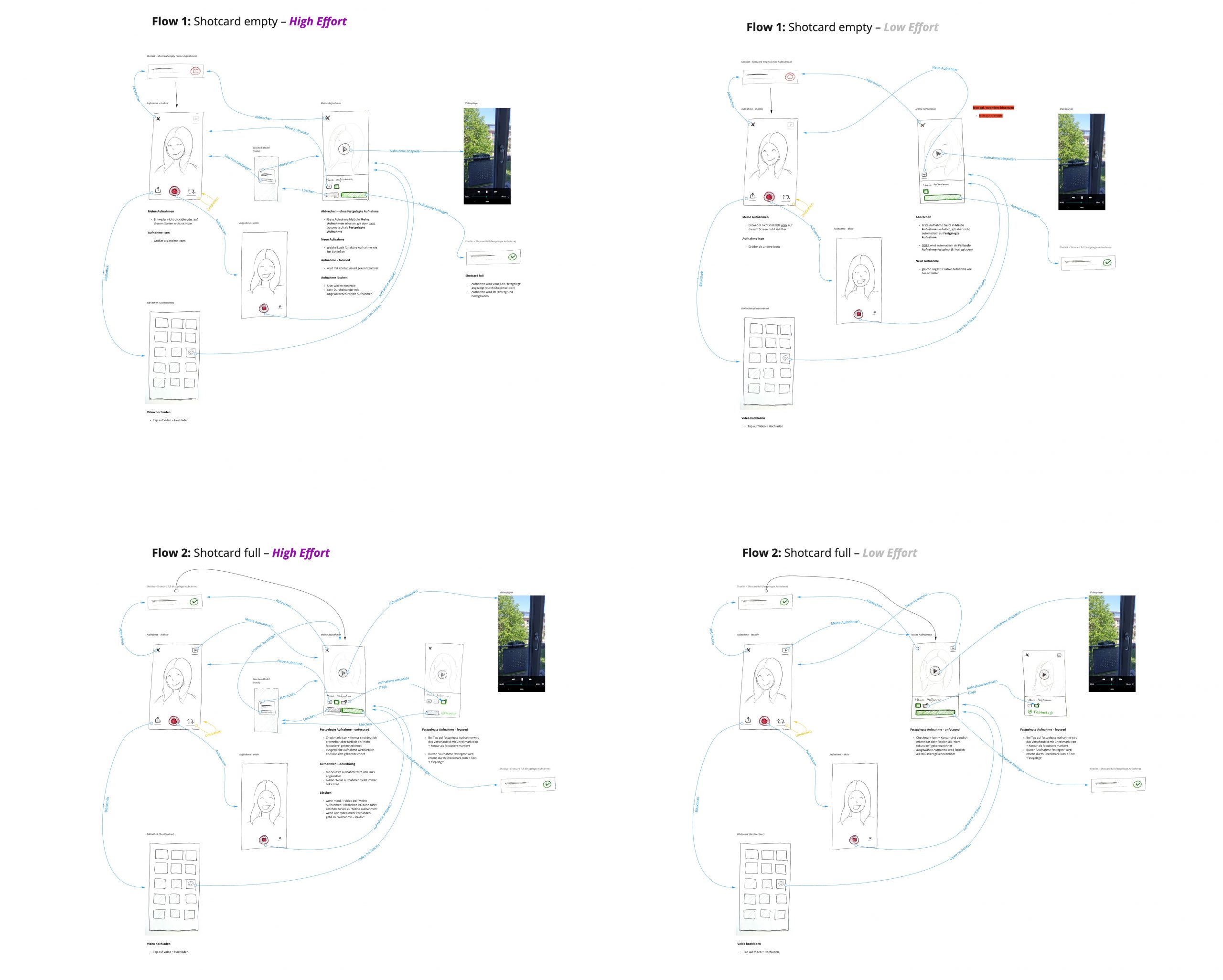
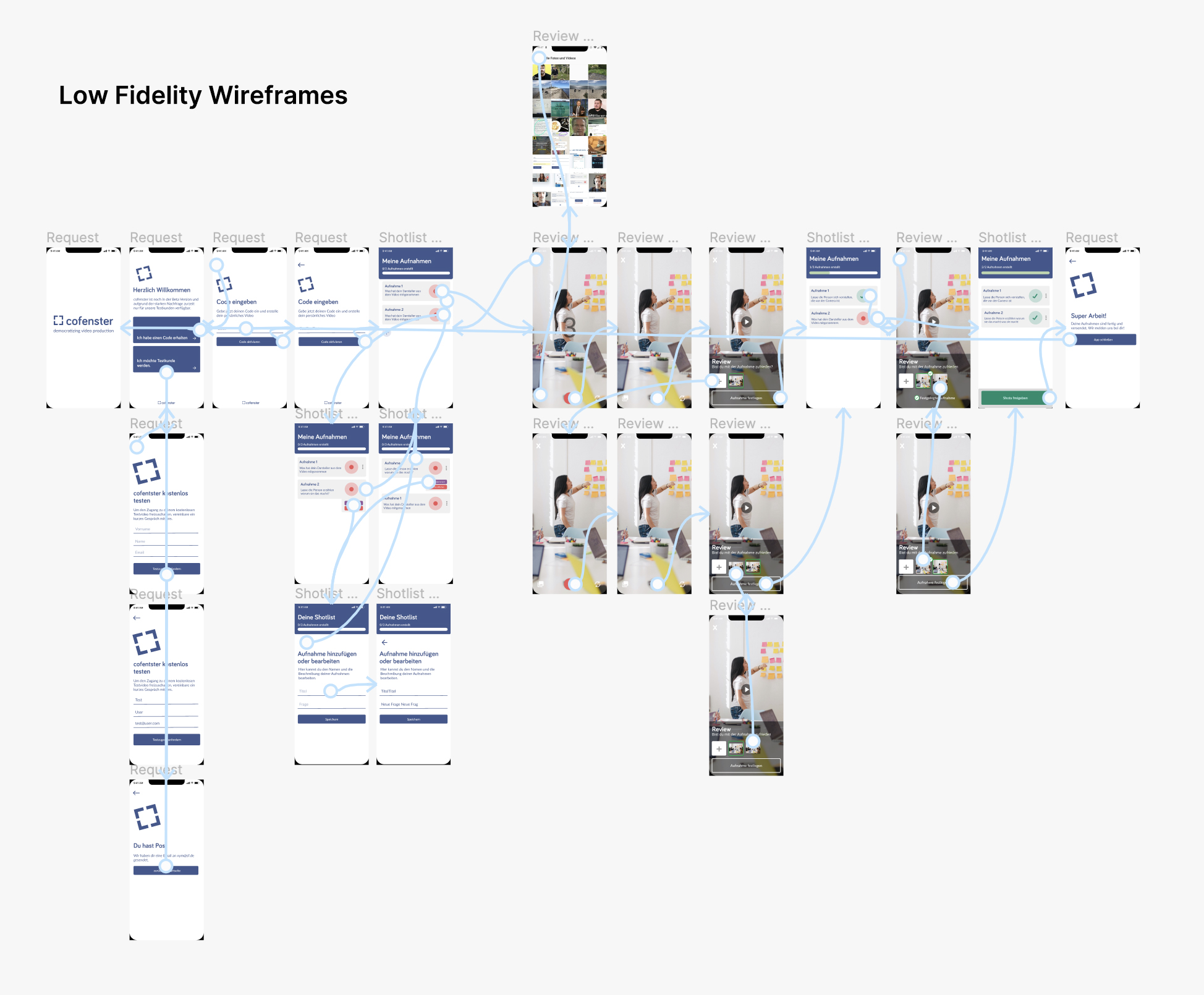
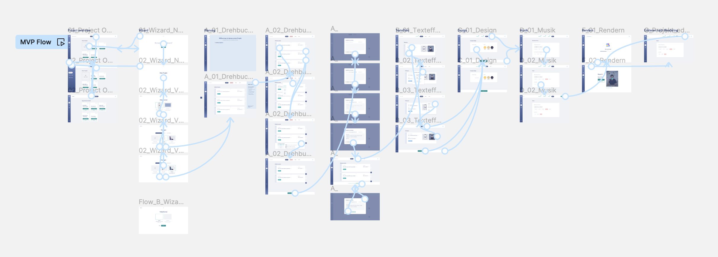
UX Concept for Mobile App
In order to test and optimize ideas as quickly as possible, I created wireframes to quickly visualize high impact adaptions. In close collaboration with the development team, technical constraints were also taken into account. The focus of the first iteration was on Low Hanging Fruits of the mobile app in order to improve the current user experience as quickly as possible. Rapid prototyping and user testing (low budget) gave us the opportunity to test and optimize new feature ideas at an early stage of development with a small user group.
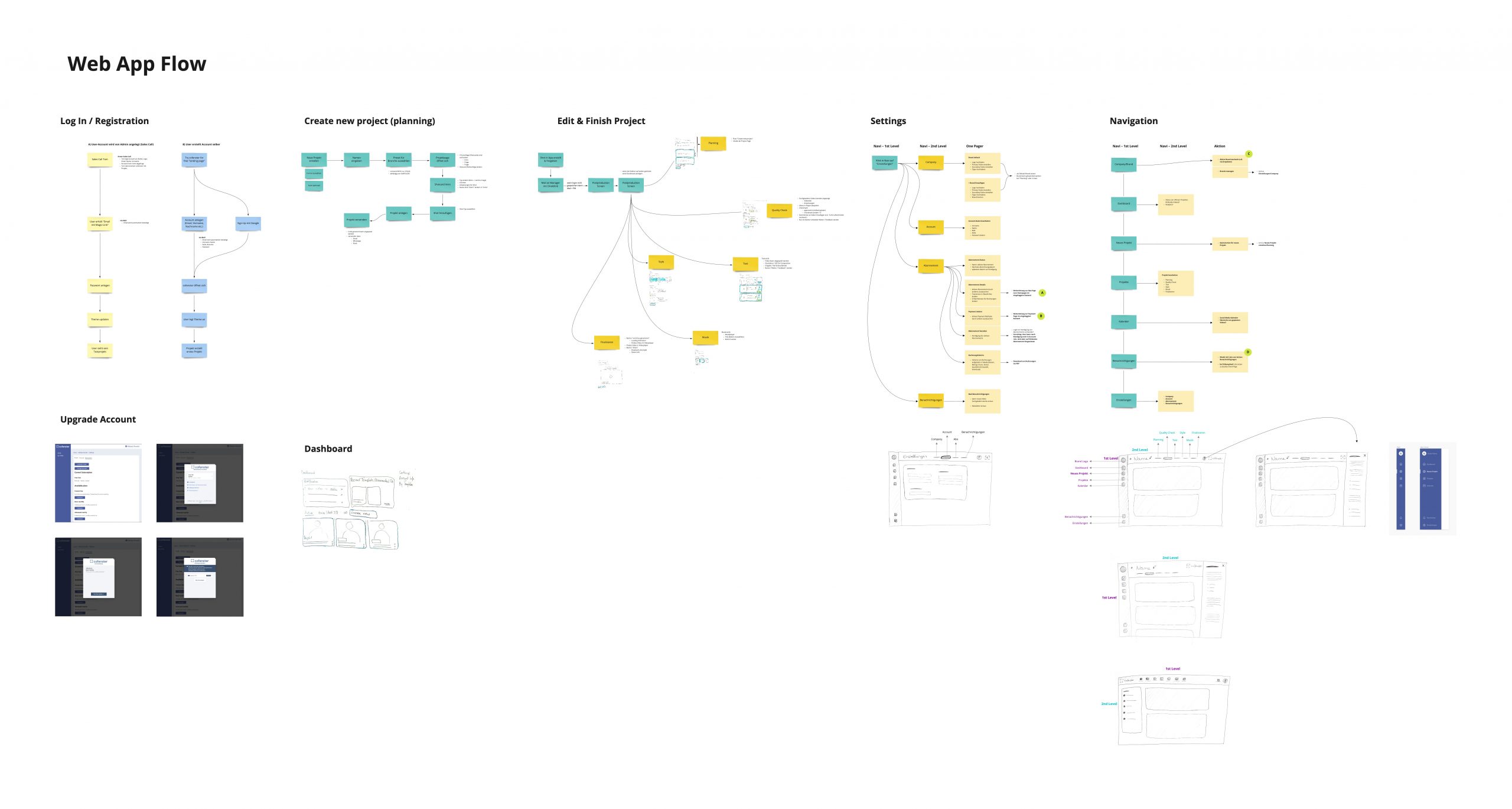
UX Concept for Web App
After the implementation of the Lowe Hanging Fruits for the mobile app, I created a design concept for the web application, which improves features and increases usability based on the current status. The aim is to make the web application so easy to use that it can function as a self-service product in the future.
Medium Fidelity Prototyping
In order to know as quickly as possible whether my design concept would work, I created a medium fidelity prototype that allowed us to test our hypotheses within a few days and, if necessary, adapt the design as quickly as possible.
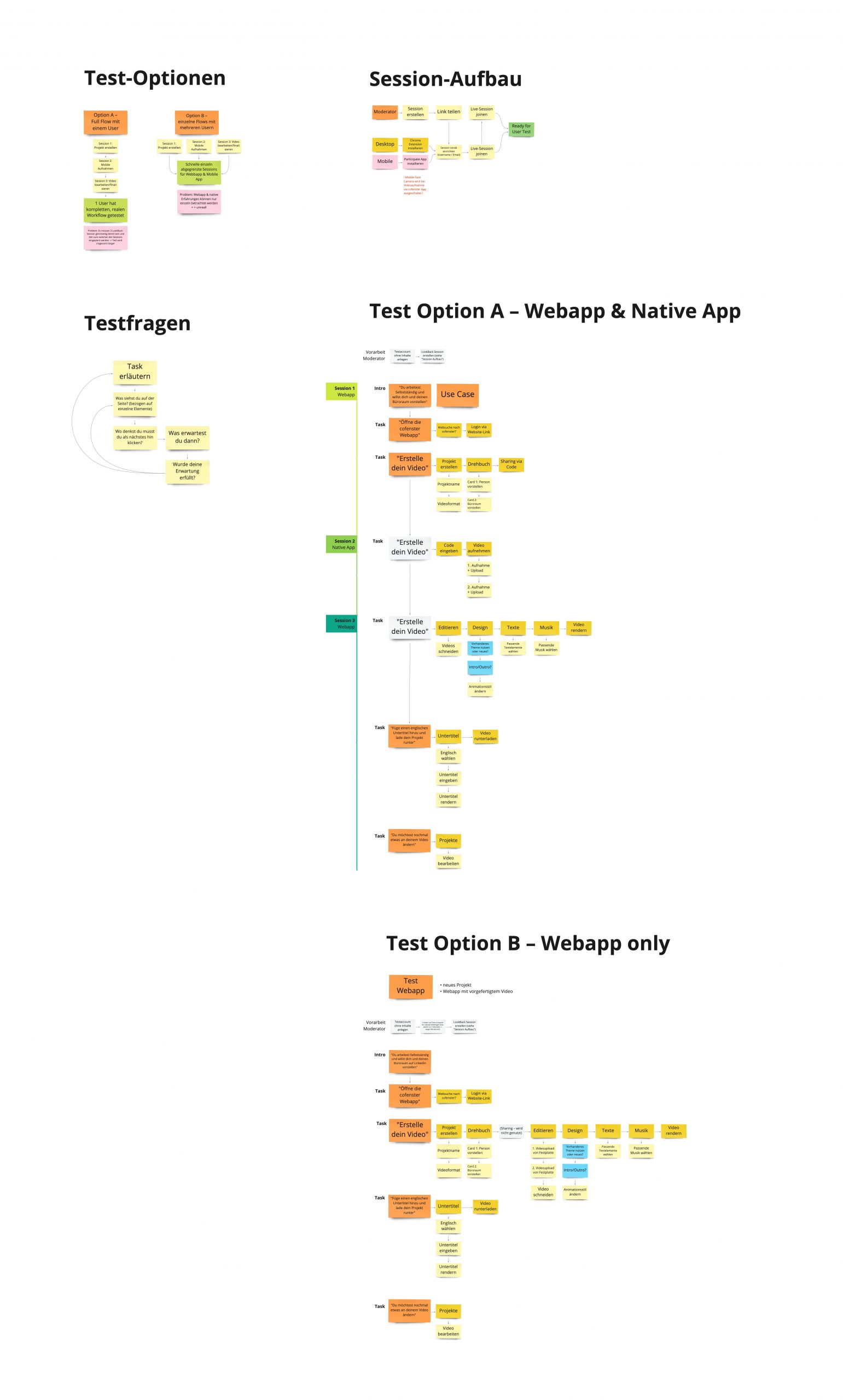
Usability Tests – Planning & Testing
I developed a lean testing concept to keep the user test process as efficient as possible and agreed this with the product team.
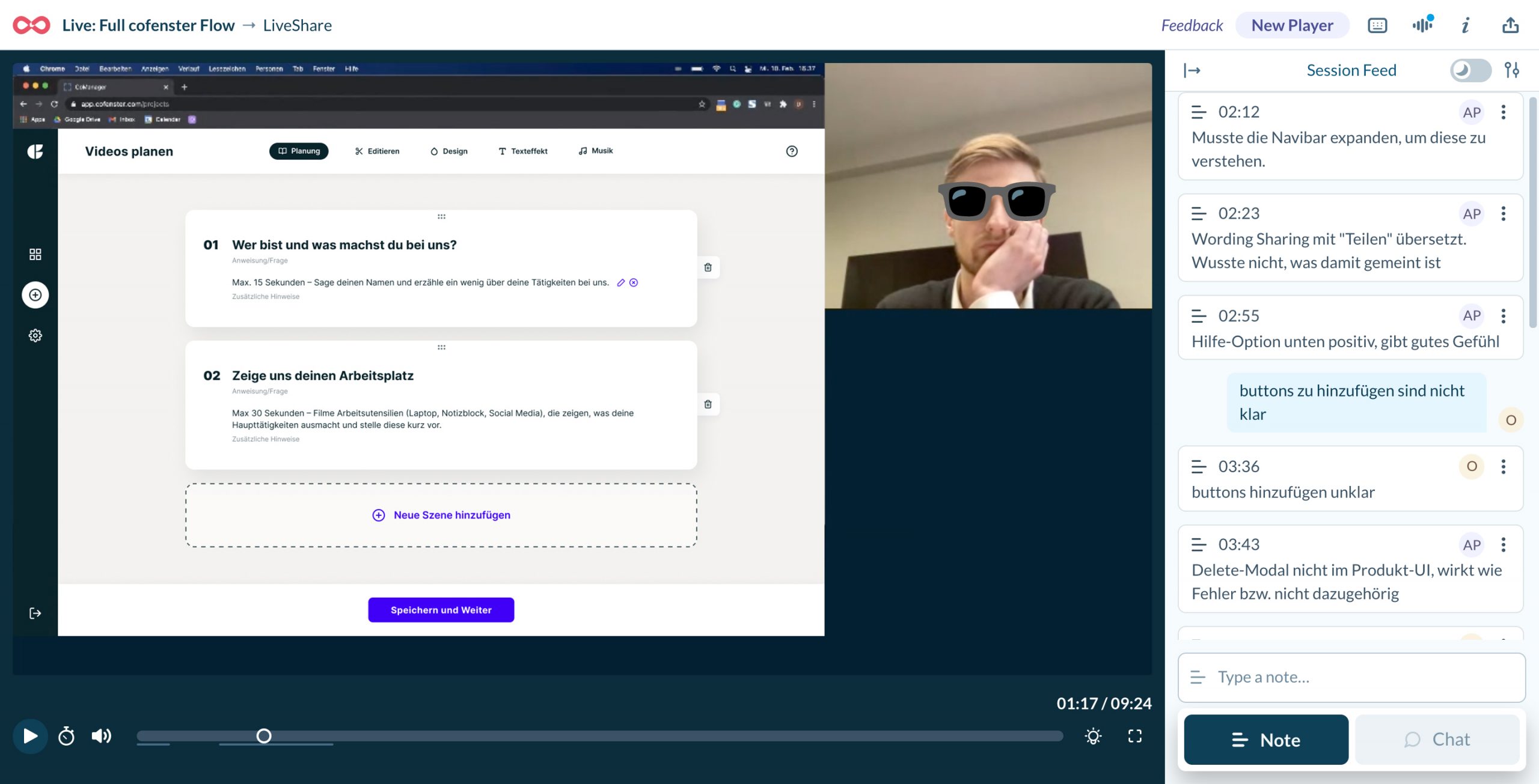
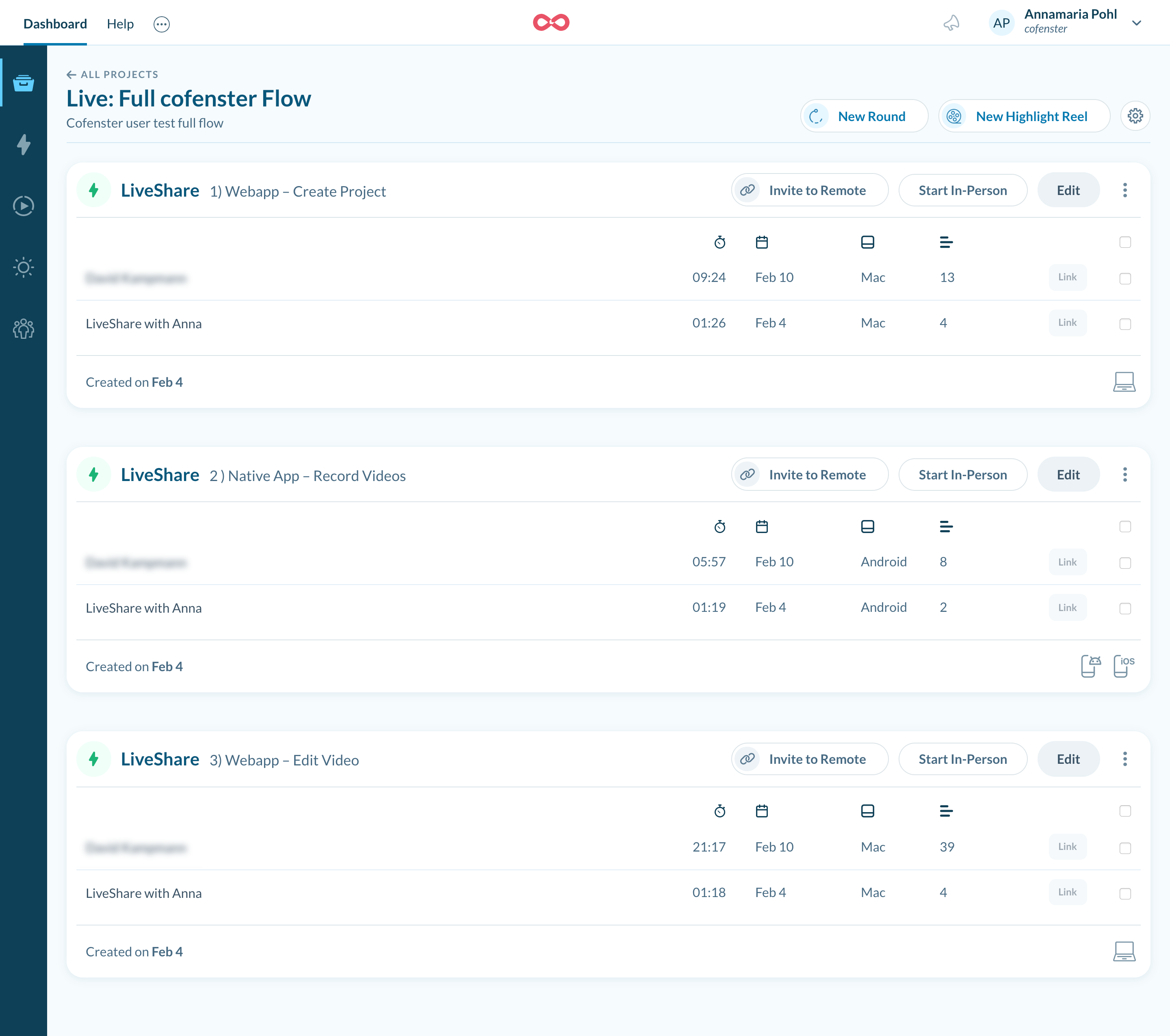
To test my prototypes, I invited users to participate in remote user tests. The prototype was tested on users who were already using the live product. This gave us the opportunity to prove improvements to the previous product faster and at the same time identify weaknesses in the new product approach. These were recorded with online recording tool Lookback and all resulting learnings were analyzed and prioritized.
User testing helped us to validate our prodct vision and gave us the chance to focus on really needed product features and workflows.
Collaboration with Developers
During the entire concept phase, I worked closely with the lead developer in short design sprints. In that way it was easy to identify potential limitations in the implementation early on and to develop a concept that would require as little effort as possible while still providing the best possible user experience in terms of usability.
UI Design & Design System
Based on Material Atomic Design, I created a design system in Figma for further feature development. It maintains design consistency and creates an easy way to prepare handoffs for developers.
The user interface design is based on Material Atomic Design patterns to make it easier to maintain the design system and allows developers to use already coded presets for a fast implementation.
Regarding the project NDA I only show a few final product images in this case study.

The project successfully transformed cofenster from a manual, internally operated tool into a scalable B2B self-service product. The outcomes below highlight my impact on efficiency, scalability and long-term product sustainability.
✅ Reduction of internal employee effort 70% of time by transforming the application into an easy-to-use self-service product
✅ Cost-efficient improvement of user flow and user experience, while the base code remained mostly the same
✅ 80% reduction in time-to-design/develop by setting up a consistent pattern library based on Material-UI (MUI) in Figma
✅ User guidance has been simplified so that even users with little digital experience can find their way around the product
✅ White Label solution (B2B) works for both marketing and full application version
